Lately I’ve fooled around with player field goal attempts per 36 minutes, but mostly from a specific shot zone and compared that to the player average by dividing by it. While it’s a statistic I’ve yet to filter by positions, it should still have some value (as you might have noticed on Twitter if we’re friends on there). It’s weird that it’s rarely cited if at all when we sometimes compare a player’s shooting percentages from shot zones with the league average, even though that has its flaws too.
One reason could be be that the player average of attempts/36 minutes is a stat that’s probably hard to find and, at least for me, takes a little bit of time to calculate. Taking that into account and since it’s a key part of this post, it’s probably helpful to post a breakdown of the player averages from each shot location from 1998 to 2014. Numbers were calculated about a couple months ago from NBA.com, and the chart is interactive so sort, filter, even type into the chart if you’d like:
We can use those averages for silly things like to see if any player over the last 17 seasons took an above-average amount of attempts/36 from every shooting location and from the free throw line. As you might’ve guessed from the title, that’s what I did here. With the minimum minute total set at 1,000 for every season except 1999 (set at 600 minutes) and 2012 (800), 46 made the cut out of a possible 4,296. Quite a few players made repeat appearances.
Below is the list where I divided their attempts/36 minutes by the player average that season, so for example if a player’s above the break 3s spat out a number of 2 or higher, it means they took at least twice the player average of above the break 3s per 36. The table itself is ordered by years but the chart should allow for sorting and filtering. You can also find a player’s per-36 numbers in a second sheet:
There are definitely some odd names on that list. Among them: 2009 John Salmons, 2012 Jordan Crawford, 2004 Tim Thomas, even last season’s Jeff Green. Those guys narrowly made the cut. Some more expected names are probably Allen Iverson, the early to mid-2000s Vince Carter, the first Shaq-less year of Kobe Bryant, the rise of LeBron James, and, of course, Toni Kukoc.
Just about all players were comfortably above the player average in attempts/36 from the above the break 3. I suppose this isn’t surprising since most centers bring the average 3PA/36 down and wings were likely impacted negatively when it came to filtering shots in the two zones inside the paint. Again, adding a position filter is a project before next season.
Overall, though, the corner 3 was the biggest dealbreaker when filtering out players who didn’t take the average attempts from a certain spot. Below is the number the list grows to if we take out the filter from each location and minutes, along with some notable players who would then make the cut:
- Restricted Area: 113. So much Ben Gordon, Jamal Crawford, Kevin Martin, and Ray Allen. Also 2003 Rasheed Wallace.
- In the Paint (Non-RA): 87. Some random names but also lots of Jerry Stackhouse, Paul Pierce, Peja Stojakovic, and Stephen Jackson.
- Mid-Range: 75. Nobody from the recent Rockets squads show up, but Manu Ginobili and Antoine Walker make multiple appearances. Also much more Gary Payton.
- Corner 3: 147. Basically every season from Iverson, Bryant, and LeBron.
- Above the Break 3: 65. Shareef Abdur-Rahim, Luol Deng, and 2014 Evan Turner.
- Free Throws: 60. Lots of randomness: 2005 Keith Bogans, 2007 Randy Foye, 2003 Rodney White, 2008 Willie Green, and 2013 Michael Beasley.
- And also minutes: 56. Lester Hudson (!!!).
- If we even made every filter 90% of what it normally was (minutes included): 137. Lots more Antawn Jamison, Metta World Peace, and about every 2004-2010 season of Michael Redd. Also included would be 2014 Goran Dragic.
Something else worth noting is how rare something like this is happening over the last half-dozen seasons. A thought on why: The change in the shooting guard and wings overall. Looking at some of the teams those players were on, it’s also understandable a few had carried a significant load of the scoring.
Overall, the last six seasons make up 35% of the time between 1998 to 2014, but the players from that span make up only 21% of the list. Nearly half of it comes from 1998 to 2004, though quite a few players are repeats. If we took out the free throw filter (which felt kind of unfair to begin with), the ratio of players from 2009 to 2014 and 1998 to 2014 is nearly the exact same.
Going forward, I actually thought Paul George was a strong candidate to join this list in 2015 despite a likely decline from the corner three, but unfortunately we know now his campaign won’t happen.
Lastly, below are radar charts visualizing the stats in the two sheets previously listed. I also tried to make the axis on each chart as consistent as possible but exceptions were made for one player. The galleries below are probably on auto-play, but they should be fairly easy to toggle through. There’s even a little animation between each screenshot. Hopefully they’re not ridiculous:
Player’s FGA per 36 / Player Average FGA per 36 (sorted alphabetically)
Player’s FGA per 36 ( sorted alphabetically)
After charting a players’ attempts per game for a while, you get to see what kind of players take on certain shapes. For the high-usage, high-scoring player, the shape is often what is seen here: A…stingray? Sometimes it’s a fat one or whatever.
All stats are from NBA.com. Not expecting these to be shared, but if you’d like to share those charts please either link back to this post or give some kind of credit involving Chicken Noodle Hoop or my name. I know both are weird to type out or say out loud, but it would be greatly appreciated. Thanks.
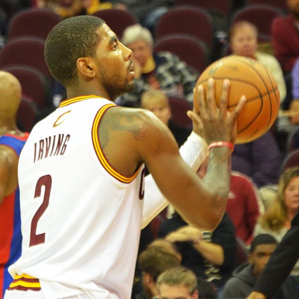
Tagged: Allen Iverson, Goran Dragic, Jason Richardson, Jeff Green, Kobe Bryant, Kyrie Irving, LeBron James, Michael Redd, radar charts, Ray Allen, Vince Carter

[…] My last post went over the players above-average in attempts/36 minutes from each of the basic shot zones plus free throws. HOWEVER, with the updated shot charts by Austin Clemens over at Nylon Calculus being so great and all, I decided to make a gallery with those charts too. […]
[…] were included in tweets with little success, but I dug myself a deeper hole by featuring some in blog posts and now a new page that lists those statistics. It starts with Shots Per 36 Compared to Average […]