Category Archives: Stats

New Page: My Soup

nwI created some wonky stats over the off-season. Sometimes they were included in tweets with little success, but I dug myself a deeper hole by featuring some in blog posts and now a new page that lists those statistics. It starts with Shots Per 36 Compared to Average Player. You can find that with regular per-36 stats since 1998 here, via NBA.com.

This basically divides a player’s average field goal attempts per-36 from a certain zone by the average amount a player averaged that season. For example, a player who averaged 4.6 shots per 36 minutes in the restricted area in 2014 took 1.15x the average attempts per 36 for a player that season. The player in that example was Josh Smith:

josh smith

In the screenshot, you can see Josh Smith also had above-average accuracy around the rim last year. I also included that for every shot zone: Restricted area, in the paint (non-RA), mid-range, corner 3, above the break 3, and free throws.

I like to think this stat is helpful, but it has its limitations. With possession totals either estimated or newly released in their exact numbers, per-36 minutes stats are outdated but this is all I had to work with over the summer. Some players’ numbers will be a tenth of a point larger or smaller because of the pace of their team(s), but I feel fine in saying that these numbers are close enough to be taken seriously.

So how to best sort through tables? They are pretty huge since they list all players as far back as 1998 and Excel’s web app has its limitations. I’d suggest using filters to find what you’re looking for more efficiently.

Here are some examples.

You can narrow down each column by clicking the drop-downs and select either ‘Number Filters’ or ‘Filter…’:

filter1

For seasons, going with ‘Filter…’ is easier. Here’s what that looks like:

filter2

You can simply check and uncheck what seasons you want. ‘Number Filters’ is more useful for shot statistics:

filter top 10

If you want to find a specific, you can go to that drop-down and go to ‘Text Filters’. I’ll look for Rasheed Wallace:

name filter 2

namefilter 4 name filter 3

But if you want to group players together, go to ‘Filter…’, though it might help to narrow down the seasons too. There are also filters for total minutes and NBA.com’s usage rates.

namefilter

Again, you can find these stats and tables of Shots Per 36 Compared to Average Player here. Over the season, I might add on to this but there’s also a good chance more stats will be found at Nylon Calculus.

Advertisement

High-usage backcourts and efficiency of their lineups

High-usage backcourts were something I fooled around with earlier in the season, though the filters I made back then (usage rates: 25 percent, players had to start together) were so stiff I had to look at backcourts across nearly 20 seasons. That was sort of the point, but at the same time there weren’t as many really high-usage backcourts as I initially thought.

This time I scaled back on the filters, making room for guards this season (74) that used higher than 20 percent of their team’s possessions. I also didn’t leave out players who didn’t start and instead fiddled with 2-man lineup stats from NBA.com featuring guards meeting both the 20 percent usage rate requirement and logging over 250 minutes together. In the end, 32 backcourt pairings made the cut. If I went by duos that each used up 25 percent of their team’s possessions, only the Dion Waiters/Kyrie Irving and Wroten/Carter-Williams duos make the list, though those tandems have rarely started games together.

Below is a visualization of each duo’s efficiency while on the court compared to their team’s average. For example, Brooklyn has scored 3.5 more points per 100 possessions than their team average with Deron Williams and Joe Johnson playing together but they’ve allowed 3.1 more points on defense. I also added “BRK” next to that duo because of how common their last names are. Hopefully the others are self-explanatory.

The color of each duo represents the range of minutes they fall in, located in the upper left. Klay Thompson and Stephen Curry have both logged more total minutes (1,904) and averaged more minutes per game (30.7) together than any other tandem, though DeMar DeRozan and Kyle Lowry are close behind (1,803 and 30.0, respectively). Duos that are in the bottom-half of the chart have their names below their dots and the opposite for those in the upper-half.

duos Rtgs adjusted (MP)

Click to enlarge.

It doesn’t seem too surprising that no combo is stifling on defense but bad on offense. Goran Dragic and Eric Bledsoe barely make that fourth of the graph with Suns lineups scoring 0.4 points less per 100 possessions with both of them on the court. If anything, lineups would normally be the other way around which is the case for 10 of the 25 pairings that score higher than their team’s average.

It’s also not surprising that the combos that stray furthest from the average are the ones with the smallest sample sizes. The larger the minute total, the closer they should be to their team’s average. Minutes per game will be looked at further down in this post.

19 of 32 backcourts logged a positive net rating, but five of the seven with nets of +9 or higher belong to the Lakers and Cavaliers combos. Some of this is because they overlap with each other while working as a trio. Below are the three most notable teams with trios along with their minutes and efficiency splits. all according to NBA.com:

Cleveland

  • Irving-Waiters-C.J. Miles: 82 minutes, 112.7/107.2/+5.5

Los Angeles Lakers

  • Jordan Farmar-Nick Young-Xavier Henry:  133 minutes, 113.2/89.3/+23.9

New Orleans

  • Gordon-Evans-Austin Rivers: 104 minutes, 109.3/125.2/-15.8

The Thunder’s combo of Russell Westbrook and Reggie Jackson (+16.2) and the Spurs’ of Manu Ginobili and Patty Mills (+15.8) stand above the five pairings from the Cavs and Lakers as the best duos.

The biggest disaster comes from Minnesota with Kevin Martin and J.J. Barea, logging 313 minutes together over 49 games for a net of -17 points/100 possessions, at least compared to their team’s overall efficiency. Over 100 of their minutes have come with Corey Brewer, Kevin Love, and either Dante Cunningham or Nikola Pekovic. The one with Cunningham gets killed on the glass and can’t take care of the ball, altogether allowing 133 points per 100 possessions while the unit with Pek has a net of -8.3 points. There are a couple Barea-Martin lineups that have yielded good results, though they’ve totaled only 20 minutes or so. Judging by the players filling out the rest of those positive lineups (Alexey Shved, Robbie Hummel, etc.), they likely beat up an opposition’s second unit.

Overall their sample size is one of the smallest. Not nearly as big of a struggle, though still pretty bad are the Gordon-Rivers and Evans-Gordon combos in New Orleans and the Rodney Stuckey-Will Bynum duo in Detroit.

So the biggest upswings or downswings come from duos and their lineups with the smallest samples, but do they also log the least amount of minutes per game? Below are the same pairings with the color of their dots representing minutes per game instead of total minutes. As usual, click to enlarge if you’d like.

duos Rtgs adjusted (MPG)

Below is a GIF that might help look at combos that log the most minutes per game.

mp/mpg on Make A Gif

There’s a slight difference in the combos that are negatives on both sides of the floor, but probably the most noticeable change comes where other pairings score a few points more. Most play a good chunk of minutes per game. Dragic and Bledsoe fit into that category and would log hundreds of more minutes if not for the latter guard being sidelined with a right knee injury.

The last graph shows which duos play the most games:

duos Rtgs adjusted (GP)

This all isn’t to say these combos are the only reason for the collective success or failure of their lineups. Maybe they compliment each other or the rest of the lineup well (or not, in terms of negative duos), benefit from playing alongside a star forward or center (or not), or beat up a second unit as opposed to starters (or…not..). As noted before, some sample sizes are smaller than others.

Some of the duos, though, just look like they’ll give up more points than they generate over the long haul, like Tony Wroten and Michael Carter-Williams not exactly being a pairing that will stretch the defense. Others like Dragic and Bledsoe look like they’ll cause chaos no matter who they play.

Any other thoughts are certainly welcome.

All stats are according to NBA.com unless noted otherwise.

Solid final quarter of season a common trait among champions

Every team has a peak and valley during their season, even the 76ers who started the season 3-0 but are now dealing with a winless five-week stretch. For a team looking to grab a top-3 pick in this year’s draft, that’s probably the right time to find their high and really, really low points of the season. As for the title contenders it should be the opposite, though a few teams are going through some recent woes whether it’s from a difficult stretch of games (Miami dealing with Joakim Noah and Boris Diaw), adjusting after a trade (Indiana with Evan Turner and other problems) or whatever else factoring into a slump (it’s all Russell Westbrook’s fault!).

History has shown that it’s fine to experience those downswings as long as they don’t carry too deep into March or April. Over the past 30 years, 26 of the eventual champions played .600 ball or better in the final quarter of the season. Also worth noting is that, with the help of Basketball-Reference, 26 of the last 28 champions finished the same stretch of games with a positive net rating.

Below are the last 30 champions with their records, offensive and defensive efficiency, and net rating over the final fourth of the season. Highlighted are the outliers. All stats are according to Basketball-Reference:

The outliers:

1995 Houston Rockets

Hakeem Olajuwon missed eight of the final 20 games with the Rockets going 3-5 over that stretch. Clyde Drexler played out of his mind during Dream’s absence, averaging a stat line of 30.0/9.3/5.5/2.4/0.9. He also made over 30 percent of his threes, something not totally guaranteed throughout his career.

In the 12 games Olajuwon played, Houston squeaked out a positive net rating of 0.1. Also, Zan Tabak played in only eight of the last 20 games. Absolutely has to be noted.

Orlando finished 9-11 as well, though they had efficiency splits of 114.2/112.3/+1.9. Long live the mid-90s Magic jerseys and Penny Hardaway.

2006 Miami Heat

Dwyane Wade missed three games while Shaquille O’Neal missed five. Each sat out the last two games, paving the way for a Michael Doleac-Wayne Simien-Antoine Walker-Dorell Wright-Jason Williams starting lineup. Miami lost both. Fun times.

Dallas also finished 11-9 that season and Dirk Nowitzki played 81 games, so what might be their best excuse? Their schedule wasn’t the greatest as they played the Cavaliers, Clippers, and Kings each twice and the Jazz, Nets, Nuggets, Pistons, Spurs, Suns, and Wizards each once. That’s not exactly the most murderous row of opponents but a mix of title contenders and playoff-worthy teams jousting for seeding nonetheless. Also mixed in the final 20 games were the Hornets with a rookie Chris Paul, the Magic with a young Dwight Howard, and the Warriors who…they stunk down the stretch, sure, but we all know what happened next year. Regardless, that’s 19 of the final 20 games. Joe Johnson and the Atlanta Hawks were the other squad Dallas faced (and defeated).

2010 Los Angeles Lakers

Andrew Bynum missed the last 13 games of the season while Kobe Bryant missed four. Pau Gasol was awesome down the stretch, though, averaging a line of 24.2/12.9/3.8 with 2.2 blocks.

2012 Miami Heat

A lockout-shortened season where resting core players was rarely a bad move. LeBron James, Wade, and Chris Bosh made only 31 appearances out of a possible 48, making way for front courts of some combination of Eddy Curry, Dexter Pittman, Udonis Haslem, James Jones, and Shane Battier. Arguably more fun times than 2006.

It might seem standard for solid teams to play any fourth of the season with a positive net rating, but that’s not exactly true. Using the net ratings from NBA.com, below are 10 notable teams of the last 15 seasons that dipped into the negatives over the final quarter:

Sure, a lot of those teams were pseudo-contenders. The 2001 Sixers, for example, were never going to win four games against a Lakers squad that mowed over their first three opponents with an offense-defense efficiency line of 113.0/96.3/+16.7, but maybe sputtering down the stretch contributed to those teams not being among the league’s elite during their respective seasons. As for the 2010 Lakers and 2013 Spurs, they clearly stand above the eight other teams in terms of talent and confidence they’d make a deep run in the postseason.

Some team over the next five weeks is bound to hit a rough patch. Maybe they’ll right themselves in time for what should be a hell of a postseason, but they could also end up as a team to write off whether it’s in April, May, or possibly even June. Below is a breakdown of the remaining schedules for a mix of title contenders and ones I don’t think will go that far in the playoffs, but included them anyway just because. Each team also has their own sheet with their last 20 games, including the (color-filtered) difficulty of their opponents. It’s a fricken rainbow.

Every team seems to have a few games in a row against teams competing (or about to compete) for lottery balls, though teams out West appear to have more daunting schedules overall.

There’s always the chance for an outlier like four of the last 30 seasons, though, but the Clips at least look well on their way to fit the minimum requirements to be labeled as a contender. That’s at least in regards to finishing steady.

But to include one last table, ending the last quarter of the season over .600 and with a sexy net rating doesn’t always guarantee making the deepest of runs in the playoffs. Below is a table of the best nets in the final fourth of seasons since 1997, according to NBA.com:

If that final table makes a team finishing hot suddenly worrisome, it probably shouldn’t. When looking at net ratings provided by Basketball-Reference in the very first table, champions often had very respectable ones. Chicago’s from 1996 is unreal.

Anyway, a lot still needs to be addressed regarding quite a few playoff teams. Let’s see how the last five weeks play out. The next two days should especially be entertaining thanks to a ton of good matchups.

For related posts, check out drastic movements in the lottery over the last two months of the season and what 20 wins before Christmas means in the West.

Change of pace: The league’s fastest and slowest lineups

Once in a while, coaches will give their team an unusual look on the floor for several reasons, one possibly being to either turn the game into a track meet or slow it to a crawl. Either way they likely disrupt the flow of the game, though hopefully to the advantage of a coach looking to change things up in the first place. This post will (hopefully) take a good look, with the help of a couple tables, at which lineups best give teams either another gear or a new set of breaks, for better or for worse.

The minimum minute requirement I made for lineups was 50. I also plucked out lineups with players no longer on the respective teams they were listed with, which impacted the Cavaliers’ units with Andrew Bynum and Chicago’s with Luol Deng, among others. The last filter I made was to adjust to a team’s average pace, otherwise the Philadelphia 76ers would represent half of the 10 fastest lineups. In the end, none of their five-man units of over 50 minutes of run made the cut. It also meant the Jazz and Bulls would make room for some the other slowest groups in the league.

Anyway, that’s about it. Below is the first table with the 10 fastest lineups. The 10 slowest are listed further down. All stats are according to NBA.com:

There’s a nice mix of lineups. Some go small with a big man to work around like Houston with Dwight Howard and Portland with LaMarcus Aldridge, each with four players to spread the floor and some able to slash. For the Blazers, Mo Williams basically replaces Robin Lopez, understandable to see it make the game as fast as possible. Also understandable is that they don’t stop opponents as efficiently as Houston’s unit.

Lineups from Brooklyn and Chicago also made the list, though only the Nets’ unit is faster than Philadelphia’s average pace of 102.68. A healthy Brook Lopez would’ve made for more huge lineups, but unfortunately they didn’t last long after the center broke his right foot. Chicago’s lineup isn’t exactly small, though on paper it feels that way without Joakim Noah. As expected, that lineup drops off without what he provides. Chicago’s overall pace hasn’t changed all that much with D.J. Augustin as the point guard, dropping by about half a possession per game since his arrival. Minnesota’s lineup is also missing their center in Nikola Pekovic. It isn’t exactly a lineup surrounding Kevin Love with four shooters, but one at least made for a track meet. Some of that pace might be helped by the outlet mall that is Love and a guard leaking out early after a missed (or sometimes made) shot.

Some more standard-looking lineups involve Denver’s, the Lakers’, Phoenix’s, San Antonio’s and Oklahoma City’s, though only Denver’s yields a positive net rating. In time, the Spurs’ and Thunder’s lineups should even out. No lineup with Kevin Durant and Russell Westbrook should be that bad. Same goes for Tim Duncan with Tony Parker, etc.

Now to the 10 slowest lineups, sorted by most snail-like to least:

Not surprisingly is Golden State making the list featuring a lineup without Stephen Curry or any point guard. That unit falls apart offensively but at least holds its own on defense thanks to the duo of Andre Iguodala and Andrew Bogut. Another big lineup, at least up front, is the Pelicans’ with Anthony Davis and Alexis Ajinca.

A similar Suns lineup to the one among the fastest in the league makes the slowest 10, arguably the biggest difference in players being Channing Frye at center to further stretch the floor instead of a Plumdog. The change on both sides of the court has been remarkable not just in pace but production as Phoenix has scored 30 more points per 100 possessions while allowing nearly 17 more.

A smallball variation that goes slow can be found in Atlanta with Elton Brand manning the middle. It’s hard to imagine any Hawks lineup without Paul Millsap, Al Horford, and Kyle Korver being even average on offense, though they’ve held their own on that side of the floor. Defensively, that Hawks unit understandably hasn’t fared well, but neither have five other ones listed. Detroit’s lineup featuring their big three with Chauncey Billups and Brandon Jennings in the backcourt is the most egregious mess, though the Wizards without John Wall and the Lakers without any resistance allow over 115 points per 100 possessions. So many flames yet so little water.

Utah’s lineup looks like one used in the last minutes of a blowout. That’s all I take away from theirs.

Overall, a bunch of the sample sizes from these fast or slow lineups are quite small when looking at minutes played. Quite a few have appeared in over 20 games, however, so it should be all right to take away some things from those tables. The easiest one for me is that it takes as simple as one substitution to alter a team’s normal pace, like how Portland’s fastest lineup involves Mo Williams substituting for Robin Lopez, or even Steven Adams for Kendrick Perkins when looking at Oklahoma City. I’d also lean towards familiarity as more of a factor in some teams struggling or thriving.

Over the next month, we’re bound to have a new lineup or two making the top 10 in one of the categories, most likely from a struggling team fiddling with players they’re curious about keeping long-term. Maybe we’ll also see the same ones with either vast improvements or drop-offs in production while others might be stored away for the rest of the season. Most teams find a middle ground with their starting lineups anyway, somewhere between 95 and 98 possessions per game, but it helps to have a lineup or two to change the flow or a starting lineup that can dictate the pace. If there could only be one lineup to change gears, though, would a much slower or faster one be more desirable for a team with a league-average pace? I guess that could make for a decent discussion with answers being player-dependent.

Any other thoughts are certainly welcome.

As a reminder, all stats are from NBA.com.

Shot locations and shooting efficiency in graphs

LeagueAvg

The percentage of a team’s points, sorted by location.

Sometimes I get bored and look for unusual topics to post about, which eventually leads to spending too much time on something like making graphs revolving around scoring and defense.

The graphs I made are pretty basic, I suppose. I might have fun with more over the weekend but I’ll just show what I fooled around with already. Basically, there are four different graphs for every team: team point distribution across six locations, team effective field goal percentage in five of those spots, and the same two for a team’s defense. All of the stats I used were from NBA.com.

The point distribution graphs show what percentage of a team’s points come from the restricted area, paint not in the restricted area, mid-range, the corner three, above the break three, and free throws. I experimented with field goal attempts per spot, but the graphs compared to point distribution looked about the same.

Below is a GIF of all 30 teams, sorted in alphabetical order. (The picture above the first paragraph was the league average for point distribution.)

Team points on Make A Gif

I can certainly post individual team graphs at another time, but I chose not to here for the sake of the amount of space it would take up.

That doesn’t mean we can’t compare some, though.

Portland and Houston are quite a contrast in styles, given one’s love for the mid-range jumper (and for a very legitimate reason) while the other neglects that part of the floor.

They both value the three equally, however:

Portland-Hou on Make A Gif

Philadelphia is somewhat similar to Houston except they rarely score from the corner three and their mid-range game is more prevalent. Also, they might have the right idea on offense but as we’ve seen recently they don’t score all that well and they struggle to defend. More on that in a bit. For now: POOR THADDEUS YOUNG.

Among other similarities are Atlanta, Brooklyn, Golden State, the Lakers, and Toronto all looking alike too.

Starting from the restricted area and going clockwise, the leader in points distributed to each category are: the Detroit Pistons (41.72%), Memphis (14.21%), Boston (22.62%), New York (21.41%), Miami (10.68%), and Houston (20.47%).

Below are graphs for where a team allows points:

Defense Distribute on Make A Gif

Among other teams, Indiana’s offense and defense are quite similar, for better or for worse.

The leaders in each category, starting at the restricted area and going clockwise are the Lakers (36.65%), Golden State (12.14%), Indiana (23.19%), Oklahoma City (18.98%), Miami (8.39%), and Phoenix (19.95%).

Effective field goal percentage from those areas of the floor — minus the free throw line — were another batch of charts I made for each team for the heck of it. You can really see where some offenses are great and others struggle from, though it won’t paint the clearest picture. The same goes for defense.

Below is offensive EFG%:

Team EFG% on Make A Gif

Miami’s efficiency is pretty freaky, especially when compared to Philadelphia’s. It helps when LeBron James, Dwyane Wade, and Chris Bosh can score at the rim far above the average accuracy all while having shooters playing alongside them.

For Philadelphia, it doesn’t help when they’re a strong candidate to “Bobcat” and very few of their players can stretch the floor consistently, and Michael Carter-Williams isn’t one of them. Like mentioned earlier, the 76ers have a good idea on where to score on offense while playing at a frantic pace, but they don’t score anywhere near enough and their defense has fallen off a cliff.

Below is their contrast in their own EFG% and their opponents’:

philly on Make A Gif

Possibly noticeable in the GIF of offensive EFG% is Chicago, who also struggles mightily on offense but their defense holds its own.

Miami’s another interesting case. They can light teams up from the corners but that’s also a place opponents have shot well from.

Below is a GIF of the 30 teams and their defensive EFG% at certain spots on the floor:

Def EFG on Make A Gif

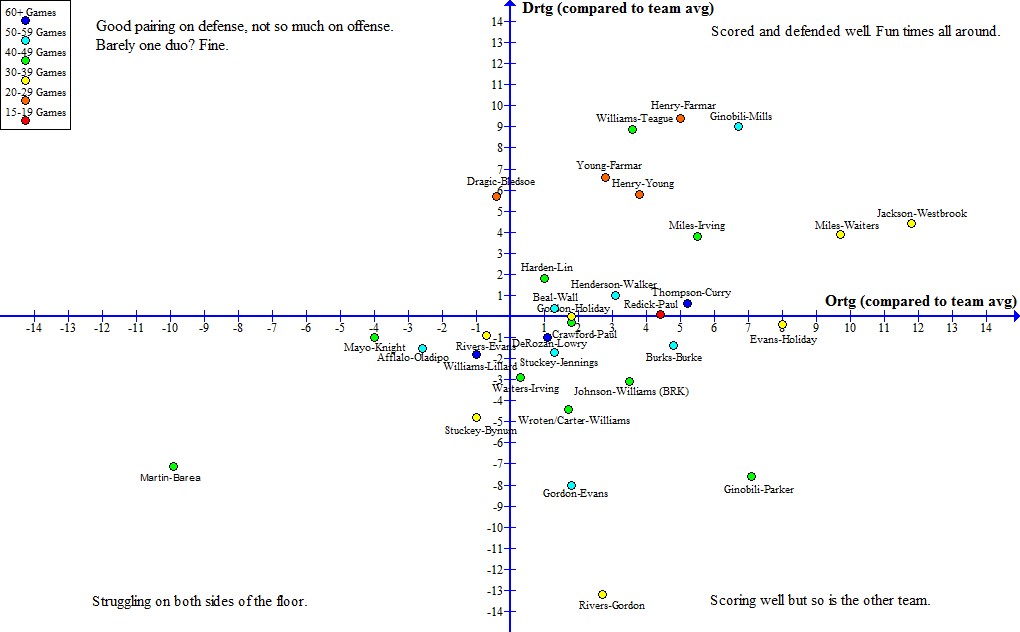
I also made GIFs of teams sorted by their offensive and defensive ratings, but overall there wasn’t a clear difference in those highly efficient in one area of the floor and those who struggle. Portland, for example, scores a bunch from mid-range with the help of LaMarcus Aldridge, but they’re also a top-5 team in offensive efficiency. On defense, the percentage they allow at the rim is quite good but they allow a ton of attempts from that area of the floor. Defense is weird.

In the future, I might fool around a little further with these kind of graphs for both teams and players. The ones listed here are pretty basic and obviously won’t paint a clear picture on offense and especially defense, but hopefully they were fun to look at and compare team by team. As (sort of) mentioned earlier, a page with every team’s graphs wouldn’t take long at all, though I chose not to include them here because of the amount of space it would take up when combined with GIFs.

Any thoughts, even if the graphs weren’t all that cool to look at, or requests on these are certainly welcome. Feel free to chime in.
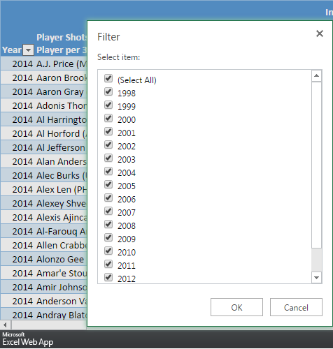
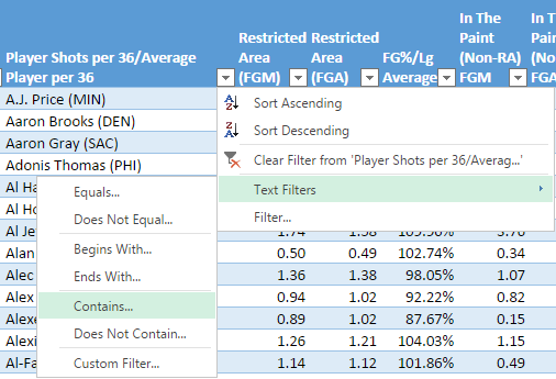
%d bloggers like this: