Charts for the players above average from everywhere, via Nylon Calculus

My last post went over the players above-average in attempts/36 minutes from each of the basic shot zones plus free throws. HOWEVER, with the updated shot charts by Austin Clemens over at Nylon Calculus being so great and all, I decided to make a gallery with those charts too.

As a reminder, below are the players that will be featured and the seasons when they made the cut. For example, 2.00 for a shot location means they took twice the player average for attempts per 36 minutes. It’s not sorted by position or pace, unfortunately, but I like to think it’s interesting. For more info check out that post:

And now, their charts in alphabetical order:

This slideshow requires JavaScript.

From my judgement, based on the charts 16 of the 46 featured a player favoring the opposite side of their strong hand, like a right-hander showing more than ~60/40ish activity on the left side versus the right. 13 of those were righties shooting much of their shots from the left side with Gary Payton‘s being some of the most lopsided. 2004 Michael Redd was one of the four lefties.

22 looked balanced (2005 Gilbert Arenas, for example) while the last seven favored the side that goes with their dominant hand. 2003 Vince Carter was one of those guys. He actually made each category, but that’s a bit easier when having four seasons on the list.

The players above average in attempts from everywhere

Lately I’ve fooled around with player field goal attempts per 36 minutes, but mostly from a specific shot zone and compared that to the player average by dividing by it. While it’s a statistic I’ve yet to filter by positions, it should still have some value (as you might have noticed on Twitter if we’re friends on there). It’s weird that it’s rarely cited if at all when we sometimes compare a player’s shooting percentages from shot zones with the league average, even though that has its flaws too.

One reason could be be that the player average of attempts/36 minutes is a stat that’s probably hard to find and, at least for me, takes a little bit of time to calculate. Taking that into account and since it’s a key part of this post, it’s probably helpful to post a breakdown of the player averages from each shot location from 1998 to 2014. Numbers were calculated about a couple months ago from NBA.com, and the chart is interactive so sort, filter, even type into the chart if you’d like:

We can use those averages for silly things like to see if any player over the last 17 seasons took an above-average amount of attempts/36 from every shooting location and from the free throw line. As you might’ve guessed from the title, that’s what I did here. With the minimum minute total set at 1,000 for every season except 1999 (set at 600 minutes) and 2012 (800), 46 made the cut out of a possible 4,296. Quite a few players made repeat appearances.

Below is the list where I divided their attempts/36 minutes by the player average that season, so for example if a player’s above the break 3s spat out a number of 2 or higher, it means they took at least twice the player average of above the break 3s per 36. The table itself is ordered by years but the chart should allow for sorting and filtering. You can also find a player’s per-36 numbers in a second sheet:

There are definitely some odd names on that list. Among them: 2009 John Salmons, 2012 Jordan Crawford, 2004 Tim Thomas, even last season’s Jeff Green. Those guys narrowly made the cut. Some more expected names are probably Allen Iverson, the early to mid-2000s Vince Carter, the first Shaq-less year of Kobe Bryant, the rise of LeBron James, and, of course, Toni Kukoc.

Just about all players were comfortably above the player average in attempts/36 from the above the break 3. I suppose this isn’t surprising since most centers bring the average 3PA/36 down and wings were likely impacted negatively when it came to filtering shots in the two zones inside the paint. Again, adding a position filter is a project before next season.

Overall, though, the corner 3 was the biggest dealbreaker when filtering out players who didn’t take the average attempts from a certain spot. Below is the number the list grows to if we take out the filter from each location and minutes, along with some notable players who would then make the cut:

  • Restricted Area: 113. So much Ben Gordon, Jamal Crawford, Kevin Martin, and Ray Allen. Also 2003 Rasheed Wallace.
  • In the Paint (Non-RA): 87. Some random names but also lots of Jerry Stackhouse, Paul Pierce, Peja Stojakovic, and Stephen Jackson.
  • Mid-Range: 75. Nobody from the recent Rockets squads show up, but Manu Ginobili and Antoine Walker make multiple appearances. Also much more Gary Payton.
  • Corner 3: 147. Basically every season from Iverson, Bryant, and LeBron.
  • Above the Break 3: 65. Shareef Abdur-Rahim, Luol Deng, and 2014 Evan Turner.
  • Free Throws: 60. Lots of randomness: 2005 Keith Bogans, 2007 Randy Foye, 2003 Rodney White, 2008 Willie Green, and 2013 Michael Beasley.
  • And also minutes: 56. Lester Hudson (!!!).
  • If we even made every filter 90% of what it normally was (minutes included): 137. Lots more Antawn Jamison, Metta World Peace, and about every 2004-2010 season of Michael Redd. Also included would be 2014 Goran Dragic.

Something else worth noting is how rare something like this is happening over the last half-dozen seasons. A thought on why: The change in the shooting guard and wings overall. Looking at some of the teams those players were on, it’s also understandable a few had carried a significant load of the scoring.

Overall, the last six seasons make up 35% of the time between 1998 to 2014, but the players from that span make up only 21% of the list. Nearly half of it comes from 1998 to 2004, though quite a few players are repeats. If we took out the free throw filter (which felt kind of unfair to begin with), the ratio of players from 2009 to 2014 and 1998 to 2014 is nearly the exact same.

Going forward, I actually thought Paul George was a strong candidate to join this list in 2015 despite a likely decline from the corner three, but unfortunately we know now his campaign won’t happen.

Lastly, below are radar charts visualizing the stats in the two sheets previously listed. I also tried to make the axis on each chart as consistent as possible but exceptions were made for one player. The galleries below are probably on auto-play, but they should be fairly easy to toggle through. There’s even a little animation between each screenshot. Hopefully they’re not ridiculous:

Player’s FGA per 36 / Player Average FGA per 36 (sorted alphabetically)

This slideshow requires JavaScript.

Player’s FGA per 36 ( sorted alphabetically)

After charting a players’ attempts per game for a while, you get to see what kind of players take on certain shapes. For the high-usage, high-scoring player, the shape is often what is seen here: A…stingray? Sometimes it’s a fat one or whatever.

This slideshow requires JavaScript.

All stats are from NBA.com. Not expecting these to be shared, but if you’d like to share those charts please either link back to this post or give some kind of credit involving Chicken Noodle Hoop or my name. I know both are weird to type out or say out loud, but it would be greatly appreciated. Thanks.  

Looking at the NBA’s 2015 non-conference schedule

Last week’s release of the NBA’s 2014-15 season schedule marks the return of the non-conference posts. Maybe we’ll find something that gives one conference a scheduling edge over the other in their non-conference matchups. For the East, that would be nice.

As a reminder, 450 non-conference games are played each season, basically taking the number of teams (30) divided by those in each conference (15). The matchups last season were historic in several ways, one being that the West outscored the East by 4.09 points per game, the highest ever point differential in the last 17 seasons, according to NBA.com. The 2014 West nearly finished with the highest winning percentage in non-conference play, but fell just short of the mark set in 2004 at 63.33 percent.

Below is a breakdown of point differential, wins and losses, and win percentage in non-conference play since 1998. You can find the same chart in the last East vs. West post last season. All stats are from NBA.com:

It’s probably obvious, but the 450 non-conference games next season are not scheduled at a consistent frequency over the season nor do they all take place within designated weeks. Below is a chart of how many of these games take place in each of the 25 weeks.

2015 non-conf games

19 of those 25 have anywhere from 14-29 non-conference games and the ones that fall below that range are opening week, the week just before and after the all-star break, and the last three weeks of the season. On the other end, weeks 5&6 (11/24-12/7), 13&14 (1/19-2/1), and 20&21 (3/9-3/22) combine to take up over a third of the non-conference games. Those two-week stretches feature 50, 51, and 56 games, respectively.

And though each team has 15 home and road non-conference games, they don’t happen equally either. Below is a chart looking at how many more home games each conference plays versus the other each week. For example, on the first week (10/28-11/2) the West has five home non-conference games versus two for the East, which amounts to +3 in the chart.

2015 non-conf home and road games

The East will have more home games early on, but it will catch up to them as we head into 2015 when the West will have 30 of the 45 games from 12/30 to 1/11 at home. From 1/26 to 2/22, the East will have 10 more home games than the West, but then the West hits another home-heavy stretch from 3/9 to 3/22.

Rest is also a factor in quite a few non-conference games. 238 (52.9 percent) of the 450 matchups will feature teams playing on equal days of rest, with 191 featuring both the West and East team on a one-day breather. Below is a chart of the total games on equal rest and those that feature rest advantages:

2015 non-conference rest


The advantage of playing games on more rest than an opponent goes to the East, 108 to the West’s 104, but the West holds arguably the most important rest advantage: Games with rest vs squads on back-to-backs, 69 games to 65 but also a 60 to 49 edge in games at home vs squads on a back-to-back. An advantage for the East is having six more games where they’ll have more rest vs opponents coming off a one-day break, best when an opponent is in the middle of a stretch of four games in five nights or three in four.

Of course, not all back-to-backs are equal. A back-to-back combo of Philadelphia and Boston is less intimidating than 2/3 of the Texas Triangle. Then again, the Knicks went 2-1 through the Spurs, Rockets, and Mavericks. Injuries and mid-season trades also happen, though the latter not nearly as often as in the past.

Predictions for teams and conferences is pointless to me, but I still see a top-5 point differential for the West with the reason as simple as the West remaining lo-o-o-oaded. That prediction isn’t as bold as saying the West will record their best ever winning percentage versus the East, but like last year a ton would have to go wrong for that to have a chance of happening. For the sake of a great season and competitive balance, hopefully Derrick Rose and the Bulls stay healthy, Toronto picks up where they left off since trading Rudy Gay, Chris Bosh returns to a strong #1 option, Cleveland has a hell of a year with LeBron James, Kevin Love, and Kyrie Irving, and the middle of the East wins a few more games than last season.

But we’re still over two months away from the regular season, which I struggle to accept. First hopeful thing comes first: Hopefully this off-season doesn’t last forever.

Sums and differences of rookie-scaled contracts since 1995

Thanks to a mistake I made in Excel, I recently updated a post from over two months ago about how much money a first-round prospect could lose in the 2014 Draft if they were drafted at a worse slot than they’re slated to go, or how much extra cash they could make if they rose.

I’m actually going to post that here as well, but along with the sum and differences of every rookie-scaled contract of first-rounders since 1995, back when Joe Smith, Kevin Garnett and Rasheed Wallace, among others, were selected. You can find yearly rookie-scaled salary at RealGM from 1995 to 2020 (a really cool page in my opinion), and the earnings from first-round draftees are consistent with what shows up in the Salaries section of Basketball-Reference’s player pages. The key thing is to multiply the salary on RealGM by 1.2, as most players get that 20 percent bump allowed in their rookie salary.

The first tables I made were for the total amount of salary each draft pick could make. These, along with every other table in this post, assume every first round pick got the 20 percent raise and played every year of their rookie contract. I also attached extra sheets about what percentage a non-first overall pick makes compared to the top draftee and the increase in salary each year from first round picks. The lockout-shortened seasons mark the biggest increases/decreases from year to year, among other noticeable things.

Take a look if you’d like. Each season is the first year of a rookie contract, so Garnett’s would be 1996, Kobe Bryant‘s 1997, Anthony Bennett‘s 2014, and so on. Below that are differences in cash from each draft slot:

Below are differences in three and four-year rookie contracts. At first I listed players with their draft slot for easy comparing, but it made tables too messy. Basketball-Reference’s draft pages might help.

Again, each season marks the first year of a rookie contract so Garnett’s would be ’96, Bryant’s as ’97, Bennett’s as 2014, and so on. Easy to mistake that when looking at sheets in the middle.

Hopefully that helps those who are posting re-drafts, something I’m seeing a lot of lately. Crab Dribbles is currently in the middle of their series from 2003 to 2013 while Amin Elhassan and David Thorpe of ESPN looked at some draft classes too (Insider-only). There’s also been some good, fun Twitter discussion about where Kawhi Leonard would land in a 2011 re-draft. Just how much would he make if he went from 15th overall to, say, second? What about others who would get a nice bump in pay?

We can look at that and a few other players who may come to mind. I had a lot of fun reading re-drafts so I actually made some of my own to look at the biggest raises from each rookie class. I’m sure a few re-picks are debatable as they’re not team-specific to begin with. I also left off initial second-rounders, but it goes to show what an uptick in the sum of rookie contracts can be like. Players with the largest increase in pay from each class are sorted by their rookie years, and I included some notes about picks I wasn’t sure of or thought were more interesting than others:

The largest increases happen when players went to the very top versus late-1sts going into the late-lotto, etc. Some players like Michael Carter-Williams (and possibly ones from draft classes down the road) would’ve had raises in their rookie contracts as large as the first year of a mini-max contract. I also think actual draft slots have an impact on second contracts, which is another post but it can be tested by what Evan Turner makes next season.

Anyway, hope this was interesting. For those continuing to do re-drafts and/or looking at this year’s prospects, hope this helps and adds a little more to discussions. Keep up the good work.

As a reminder, salaries are according to RealGM.

Career shot and point distribution charts: Ray Allen

BorLez8CAAERt9c

Lately I’ve been getting back to looking at shot and point distribution charts, ones of players still in the Finals and a few other greats over their entire careers. The charts are the ones I’ve used for players and teams in previous posts, tracking shots on NBA.com from the restricted area, in the paint non-restricted area, mid-range, corner 3, above the break 3, and free throws, but I’ve recently added a few more charts to the mix. This post is basically a trial version of them with Ray Allen’s being the ones tested, and if it turns out all right I might turn it into a blog series over the off-season.

There will probably be some tweaking to do, but for now I plucked Allen’s yearly numbers from NBA.com which somehow has shooting stats and charts starting not at 2001 but 1997, though I don’t consider the ones from ’97 to be all that accurate thanks to the shortened three-point line back then. We get to work with every other season of Allen’s career, though, and maybe other notable players from the late-90s to today.

In past posts, I included GIFs and/or screenshots to show changes in charts from each season, player or team, and while I’ll use each of those for this post I’ll also use galleries so readers can cycle through charts at their own pace. The galleries also provide a little animation between each season to help show shifts in shooting and scoring.

Hopefully all of that isn’t confusing, but I can be pretty lazy with explaining things. For those who haven’t looked at these kinds of charts before, maybe just looking at them is easier to understand anyway.

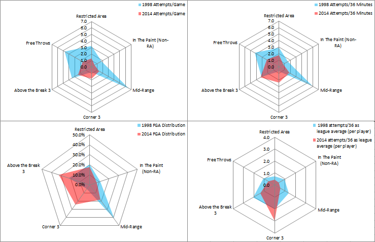
Allen’s attempts over his career from both the field and the free throw line were what I looked at first, and below is an example of the four different charts I made for that section. This one is from 1998’s available stats:

1998 rayface

My apologies if screenshots look a bit blurry. They look much sharper when clicking to enlarge.

The first 3 charts are mostly similar with FGA distribution missing free throws, of course, but that one and attempts per 36 minutes compliment Allen’s first chart (attempts per game) best in his later years when his minutes and total attempts decline.

The last chart, attempts per 36 minutes compared to the player average, is something I’ve recently been playing with, though it doesn’t adjust for pace. In 1998, Allen took nearly six mid-range shots per 36 minutes, but compared to every other player’s numbers it was more standard than his attempts from the corner three, where he took twice as many attempts/36 minutes as the average player. This is a pretty common theme over Allen’s career.

Below are the rest of Allen’s attempts in a photo gallery. It should be on auto play, so I guess in way it’s still a slow-moving GIF, but it can be paused any time:

This slideshow requires JavaScript.

Where Allen shoots from each location has obviously changed over the years, once heavy on mid-range shots and almost always making a ton of either above the break threes or corner threes compared to the player average.

Below are the differences between his second and 18th season of his career (1998 and 2014):

1998-2014 rayface

Allen still takes a similar amount of above the break threes per 36 minutes as he did in 1998, but now he attempts about 3.5 times as many corner threes, half the free throws and shots in the paint (outside the restricted area), a third from mid-range, and about three-fifths as many around the rim. It also shows how three-happy the league has become with Allen’s above the break 3s/36 minutes more standard now than compared to the late-90s.

Some of Allen’s changes are consistent with how his FGA distribution has changed with each team. Below is a GIF putting his combined point distributions for each team together (click to enlarge):

Allen on Make A Gif

Along with the roster around him, age most likely contributes to Allen’s shift in FGA and FGM distribution. With the Heat, it also changes a bit when he’s in lineups with or without LeBron James:

ray w-o lebron


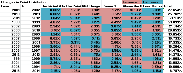
I also looked at Allen’s biggest changes in FGA distribution from season to season, basically by a simple subtraction of percentages. I took 1998’s percentages and subtracting them from 1999’s, for example, then made every change in percentage positive and adding each location’s numbers up.

This is what each season looks like, sorted by biggest total changes to smallest:

ray fga change overall

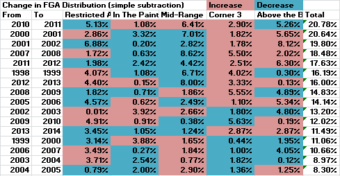
Visually, that looks correct when looking how the largest and smallest changes stack up (as usual, click to enlarge if you’d like):

ray fga change large 2010-11

Allen took more of his attempts from mid-range in 2011 despite having a fourth straight decline in usage rate, but he also took a higher percentage of his attempts from the corner three and, as shown much further down in this post, he was way more accurate there than in 2010.

Mid-range and non-restricted area paint attempts are the biggest differences in 2004 and 2005, but everything else looks the same otherwise. When comparing changes in Allen’s FGA distribution in 2003 before and after the trade that sent him from Milwaukee to Seattle, his chart hardly moves and would be the lowest compared to season-by-season changes, totaling to a 6.53% change. (Threes were a different story. More on that later.)

Simply subtracting doesn’t take into account the shots Allen takes least (depending on the season, either corner threes or in the paint non-RA shots) and most (either shots around the rim or above the break threes). It’s often a bigger deal if a player or team takes five percent more of field goal attempts from the corners than around the rim, and I tried a couple ways to balance for that but hit snags since they’d be hopeless if Allen (or any other player, or team) took zero percent of their shots from one of the five locations. Also, I’m terrible at math and maybe over-thought the whole process, so if there’s an easy way to calculate that stuff I’d love to hear it since I’m looking into shooting and scoring by teams over each season, among other post ideas.

To go back to mid-range and other two-point shots, though, it may or may not be surprising that Allen took as many as he once did, though that can be said about the league as a whole. Mid-range shots made up a great chunk of Allen’s shots for a long time, and about 20 percent of his attempts as a member of the Heat still come from that area of the floor, but that’s down from what was anywhere from 25 to over 40 percent as a Buck, Sonic, or Celtic.

Looking at his shot charts at NBA.com that split into several locations, less of his twos come from the wings now than they did as a Sonic or Celtic, but there’s still a similar amount from the baseline where, for most of his career, Allen took the most of his jump shooting twos.

Below is a breakdown of Allen’s 2PA distribution according to spots on NBA.com’s shot charts. I gave locations names that are hopefully self-explanatory, but can be found here just in case:

2pa dist

As usual, click to enlarge. Very helpful!

Allen’s baseline shots are the standard ones from being run off the three-point line and getting separation off screens, but quite a few come from trying to get space off the dribble when the shot clock is winding down. He doesn’t get all that far, painful to watch when he was once so good at attacking off the dribble (one example here), but he doesn’t need much space to get his beautiful shot off anyway.

Even if Allen seems to struggle a bit more in getting to the rim off the dribble, he’s still having career-lows or near career-lows in attempts/36 minutes from all the 2PA locations on NBA.com’s shot charts all while having a career-high in corner three-point attempts/36 minutes and percent of his FGA being corner threes. His mid-range shots/36 minutes have gone from around or above league-average in his first 15 charted seasons to two-thirds and nearly half the average in 2013 and 2014, respectively, and he shot nearly three times as many corner threes per 36 minutes as the average player this season. The leaders from the corners each season often take four to five times as many as the average player, though, sometimes even more when looking 10+ seasons back. James Jones led all players this year by taking 5.8x corner threes/36 minutes, but in 2005 Donyell Marshall took 7.1 times as many, then followed it up with 6.0x and 5.8x as many while Cleveland in 2006 and 2007, respectively. Fun times.

To touch on free throws, Allen’s charts almost always show him above the player average in free throw attempts/36 minutes during his prime which, like his attack off the dribble, feels underrated considering his status as a killer shooter.

I found his free throw and three point rates to be pretty interesting, even though they seem common in both his age and that when the free throws lower the threes often rise:

ft and 3p rates

I’ll touch more on threes later when chiming in on some thoughts on Allen’s scoring distribution, which I looked at in a similar way to shot attempts but with some tweaks. Below is a gallery visualizing four scoring stats from 1998 to 2014, but with some changes in charts from attempt distribution:

  • Points per game from the six spots on the floor.
  • Effective field goal percentage from all but free throws.
  • Point distribution but this time including free throws, unlike in the first gallery of graphs.
  • How Allen’s points/36 minutes from each spot measure up with the league average (per player).

Anyway, flip through the charts if you’d like:

This slideshow requires JavaScript.

There are some hopefully cool things to look at. Going back to mid-range shots, below is a similar graph like before but covering 2PM distribution:

2pm dist

And a gallery comparing 2PA and 2PM distribution. Flip flop if you’d like:

This slideshow requires JavaScript.

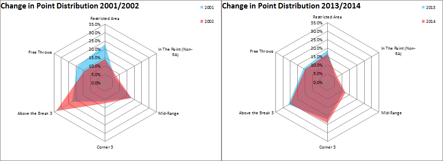
Season by season, Allen’s changes in point distribution from largest to smallest are a bit different from changes in FGA distribution, where the largest for that was from 2010 to 2011 and the smallest from 2004 to 2005:

ray point dist change overall

Understandably, the smallest change in point distribution was in Allen’s second season with the Heat. The largest change was not after a trade in 2003 or 2007 or going from the Celtics to the Heat in the summer of 2012, but from his seasons as a Buck in 2001 and 2002. 

Again, with simple subtraction, that all looks correct visually:

ray pt dist big and small

From 2001 to 2002, Allen scored less from the free throw line but upped his three point rate from .357 to .460. He took 3.67 times the average player’s corner 3s/36 minutes, ranking tenth minimum 1,000 minutes. For above the break threes (he attempted 3.32x the player average), he was only behind Antoine Walker (3.64), Jason Williams (3.70), and Tim Hardaway (4.22).

No shame in falling just behind those three players in anything related to threes, and Allen’s got pretty nuts when flipping through the 1998-2003 section of the scoring gallery shown above. Maybe suspected from the 2002 charts: Allen placed in the top 10 that season in both threes attempted and made for both the corner and above the break three. It started a string of top 10 finishes in the latter location:

ray 3pa-36 min leg avg

I thought Allen’s threes deserved a gallery of multiple charts, featuring both three-point attempt and made distribution from the five spots available on NBA.com’s shooting charts, another with accuracy from those locations, and a line chart tracking the shooting swings each season.

This slideshow requires JavaScript.

1998, 2002, and 2010 look almost perfectly balanced in attempt distribution from each spot, while some weirdly (for a right-handed shooter, anyway) show a great deal of threes from the right wing. Also, to go back to the graph of his shots with and without LeBron on the floor, it’s no surprise to see Allen taking more of his threes from the corner as a member of the Heat. Last year he teed off from the left side, but this year it’s from the right. Attempts from straight away are just about gone and weren’t ever a big deal anyway.

Below is a GIF of Allen’s combined distributions during his Buck, Sonic, Celtic, and current Heat career. The differences in attempted and made threes are pretty minor (click to enlarge):

A4ZqD7 on Make A Gif, Animated Gifs

Followed by that GIF are threes in 2003 before and after the trade that sent him from Milwaukee to Seattle. Quite a change midway through the season:

ray 3pa dist mil-sea 2003

Again, it’s kind of weird to see a right-handed shooter take a bunch of his attempts from the right wing, but Allen went through shifts from just about everywhere but from straight away. Shots from the corners and from straight on barely changed, at least in attempt distribution.

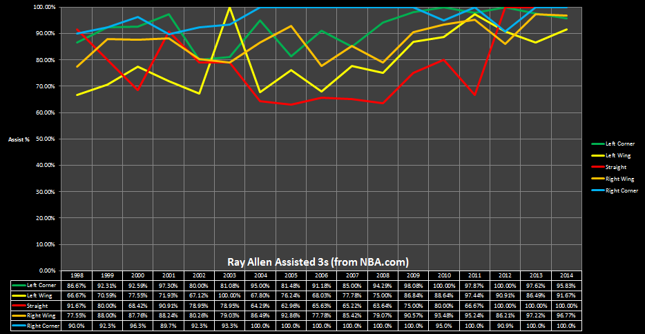
Lastly, Allen’s assist percentage on threes over the last two seasons are some of his highest ever. Among other notes, the right corner was a flat 100 percent for six straight seasons with 114 assisted threes during that stretch:

ray 3 ast%

Allen’s long been one of my favorites to watch from the times his NBA Live ’98 player torched me to how unfair he can make Miami’s offense just by standing in a corner. His charts were a test to see how they look in a blog post and if readers would be curious about ones for other players. A lot of other greats over the years have some cool charts, or maybe I’m biased because I was so curious about them to begin with. Probably the latter.

Some other thoughts:

  • I could’ve added playoff shooting and scoring, but was worried it would clutter this post even more.
  • Clutter…were there too many charts? A lot of them were player dependent, though. As much as I’d like to, I’d probably refrain from 3pt charts for someone like Tim Duncan. Maybe throw in a game of Solitaire instead.
  • The charts obviously don’t tell everything, like I can’t even put together SportVU-related shooting charts because the numbers don’t add up to Allen’s total points. I could try fooling around with them for other players, though, and see if something’s presentable.

Oh well. Curious what others think of this post and if any tweaks could’ve been made. This is definitely a trial version of posts I had in mind for other players and was also a post meant to shake off a ton of rust over the last few weeks.