Tag Archives: NBA

East vs. West Week 25: Final standings with offense-defense splits

The East vs. West series started thanks to the West’s usual dominance over the East this season, but also thanks to a post by Basketball-Reference detailing the historical disparity in the conferences over the years. This is the final post this season.

A bit late thanks to a fever that doesn’t seem to be letting up anytime soon and looking into a few projects going forward, but below is the final week-by-week non-conference breakdown. Followed by that are the final point differential tables and also some splits for how teams performed versus each conference and on the road or at home. There are some pretty glaring differences in each.

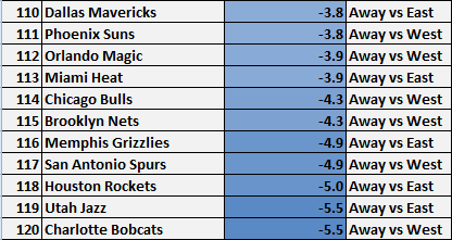
But below is the breakdown first:

The last game featured Detroit Detroiting to Oklahoma City, falling in the final minute to a Thunder squad looking to clinch the second seed out West.

Onto point differentials with the first sheet comparing this season’s margin of victory with others and the second sheet looking at month-by-month splits of this year.

Lastly, thanks to some boredom but also hoping to add something to the last of these posts, below are some home-road east-west splits for offensive efficiency, defensive efficiency, and net rating. Since I still can’t figure out how to let readers sort through columns (it might be available on the newest version of Google Sheets, but still no luck embedding those to here), I color-coated rankings:

Something of a TL;DR section for the tables above, starting with offensive efficiency and ending with net rating:

    • Sample sizes are somewhat small for each. There are 15 non-conference home and road games and 26 games each for teams in the same one, but especially for squads in the same division. It makes for some big swings when comparing splits, especially for a team that goes through a roller coaster of a regular season like, for example, a trip to the West coast while dealing with injuries or turmoil then hit its stride after hosting some games.
    • There’s a noticeable drop-off when comparing arguably the easiest games (at home versus a team out East) and arguably the most difficult (on the road versus a West squad). Comparing the former to the latter, New Orleans has the biggest decline in scoring, scoring 10.2 points/100 possessions less. Detroit, Milwaukee, and Cleveland have upticks, oddly enough.
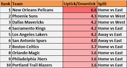
    • When comparing those splits to a team’s overall offensive efficiency, here are the biggest increases and decreases: :
    • Uptick/Downtick compared to overall efficiency (offense)
      UpticksplitO downticksplitO
    • Like scoring for teams hosting East opponents compared to on the road against the West, the difference in allowing points per 100 possessions is pretty large. Again comparing the former to the latter, every team allowed more points on the road against West teams with Cleveland at the largest with +14.1 points.
    • For nearly the entire season, the Spurs were the only team to allow less than 100 points when on the road against the West, a spectacular feat when they rested their trio (and more) for a decent chunk of those games. That accomplishment disappeared after their games at Oklahoma City, Minnesota, Dallas, and Houston.
    • Below are the largest upticks and downticks in defensive efficiency when compared to a team’s overall numbers. Captain Obvious maybe, but here’s a reminder that downticks in defensive efficiency are good when regarding the screenshots below:
    • Uptick/Downtick compared to overall efficiency (defense)
      upticksplitDDownticksplitD
    • The last sheet, regarding net rating, features some more startling numbers. Indiana somehow has a negative net on the road against East teams while Minnesota, among others, has a quite a change when comparing games at home versus the East to any other split.
    • There’s also a 20 point/100 possession difference for New Orleans when comparing games at home versus the East and on the road against the West. It’s the highest difference when comparing those two splits. Indiana (16.1), Houston (13.7), Chicago (13.5), and Minnesota (13.0) round out the top five.
    • The Spurs and Clippers are among the more consistent teams when comparing each category.
    • Overall, this all confirms the obvious: Teams often performed much better against the East than the West and even more when adding home-road splits, though the sample sizes for each are somewhat small.

This was a fun series to fool around with each week, and it was nice to see these posts recently assist two of my favorite writers and tweeters, Zachary Bennett and Matt D’Anna, in looking at how to retool divisions and conferences, or even get rid of them. That probably did more for me than it did for them since it looks like this blog has a few extra readers daily, and it was nice to know there was at least some usefulness in these posts. Good stuff. I definitely celebrated with a ham sandwich. It was fantastic.

But that’s it for this series, at least until next season when I could see the West pulling off a top-5 point differential. There are some likely rising teams out East like Washington, Toronto, and Chicago in a way, among others, but the West has as many if not more teams that should improve like Phoenix, New Orleans, and possibly the Lakers and ones that should stay legitimate in Oklahoma City, Houston, and the Clippers. Of course, there’s a whole off-season to play out and the East could balance itself somewhat with teams rising from the lottery to 40-win territory, but for now I’m siding with yet another loaded Western Conference.

Game-by-game shot locations for each team

About two months ago, I wrote a few things about the Knicks and their excessive shooting from the perimeter. Part of what was looked at were game-by-game shot locations for teams from NBA.com, but ever since writing that post there wasn’t a whole lot of usefulness with a season’s worth of shot location logging when it came to presenting it.

With the season concluding last night, however, I decided to release the entire document in this post. Along with that, I made three tables to highlight some of the best and worst performances by teams from each of the five spots on the floor: restricted area, paint non-restricted area, mid-range, corner three, and the above the break three. Unfortunately, I never tracked free throws. Maybe next season.

The three separate tables include the top 10 games with the most and least field goals made from each spot, most and least field goals attempted, and the hottest and coldest performances from each shot location. (Scroll a little further down in each table for the least/coldest shooting games.) For some categories with ties, I included a few extra games just because.

Some teams will dominate certain categories, for better or for worse, like how some may expect Houston to make a joke of the least mid-range field goals attempted. For every table I’ll also include some notes, something like a tl;dr section.

Anyway, the first table is the most/least field goals made from each location. You can toggle through each location with links to them at the bottom of each table. Again, for the entire document, this link should do the trick along with sheets detailing percentage of attempts outside the paint and percentage of attempts in high-efficiency spots versus dead zones.

Restricted Area: Not surprisingly, the Los Angeles Lakers got fried around the rim while the opposite can be said for the Pacers. All of the latter’s appearances in the least attempts around the rim came before the all-star break, but it shows just how suffocating they’ve been when clicking 100 percent.

Paint Non-RA: A good mix of teams and opponents for the most makes. Another not-so-surprising stat is how many games played out where a team was scoreless from this location: well over 40.

Mid-Range: The teams that shoot a ton from this location (Portland, New York, Orlando) make the list for most field goals made, Portland being at the top thanks to a 26-for-49 outing against non other than a team like Indiana. Houston and Detroit, the former neglecting this location while the other can’t space the floor all that well, fill up over half the slots for the least field goals made.

Corner 3: A mix of teams and opponents for both categories. A lot of struggling defenses gave up the most threes from the corner, however. Washington is the only team to make 10 in one game with Milwaukee being the casualty.

Above the break 3: Another variety of teams. Minnesota, one of the most frustrating teams from beyond the arc (in my opinion), actually makes the top 10 twice. More of the typical struggling teams from the perimeter crack the bottom 10: Memphis, Philadelphia, Detroit, Utah. Memphis is the only team to make no above the break threes in a game. Their opponent? Chicago.

Onto most and least field goals attempted:

Restricted Area: Detroit, a team that feasts around the rim, naturally is featured here. Philadelphia and Houston unsurprisingly crack the top 10 as well. The results for the bottom 10 may or may not be expected as well. Teams like Brooklyn, Boston, and New York make that list. Sacramento has the lowest attempts with 8. Crazy. That’s 45 less attempts than the leading Detroit.

Paint-Non RA: A mix of good defenses allowing the most attempts and bad ones allowing the least from this location. The Kings are a surprise in the top 10, however, making the list as an opponent three times. Some good and struggling offenses make the bottom 10 in attempts with Miami and New York each making it twice and Chicago once.

Mid-Range: Houston makes a joke of the bottom 10 attempts in a game. There’s a wider variety in the top 10 but Portland, Boston, and Washington unsurprisingly are featured. Indiana and Chicago account for half the opponents in that top 10.

Corner 3: Some brutal defenses make up the opponents in the top 10 with a mix of solid offenses as the ones teeing off from the corners. The opposite can be said for the bottom 10. Yeesh. 14 times has a team attempted no threes from the corner. Some good defenses and ones that struggle but do take away the corner (Portland) are the opponents during those games.

Above the break 3: A bunch of games that went into overtime make up the top along with a lot of solid teams and…Philadelphia. At the bottom, New Orleans and Memphis make up 2/3 of it with the latter shooting the least amount of threes from above the break with 3. Sigh.

Lastly, hottest and coldest shooting:

Restricted Area: Oklahoma City makes the top 10 multiple times, but Miami is absent despite their trio of LeBron James, Dwyane Wade, and Chris Bosh all feasting from that location. A few of the struggling offenses make up the bottom, as usual. No team missed 75 percent of their attempts, however, so there’s that.

Paint Non-RA: Tons of scoreless outings from this spot on the floor with the hottest shooting coming from less than 10 attempts. Dallas, Chicago, and New York are the only ones to shoot perfectly.

Mid-Range: Quite a few brutal nights, with New York’s Knicksy performance at Milwaukee probably being the worst. Brooklyn, with all the decent shooting they have, holds the worst park percentage-wise, however, at 19 percent on 4-for-21 shooting. Ouchies!

Corner 3: Lots of perfection here with New York’s KNICKSY game at Milwaukee topping all others. The worst outings come against a mix of both good and bad defenses. Not surprising, though, with how only a handful attempts or so available each game.

Above the Break 3: Indiana and Chicago each allowed a couple of the best shooting nights, though against respectable teams in the Suns and Clippers, respectively. There have sadly been 13 scoreless games from this location with the usual struggling teams from the arc being featured. Utah holds the worst performance at 0-for-14 against Dallas from just over a week ago.

But that’s it! A brief summary of each location. To explore the entire document and some other sheets I fooled around with from earlier posts, click here. Unfortunately, as someone not too experienced with Google Sheets, I can’t figure out a way to sort through columns. Any help would be appreciated since it’d be nice to let others sort their way through the document.

Other than that, enjoy the break until the playoffs.

As a reminder, all stats are according to NBA.com.

East vs. West Week 24: Eh???

Updated week-by-week breakdown with an added column: point differential for the West through each week.

The one game left is Detroit taking on Oklahoma City on Wednesday, guaranteed (probably) to be fun for no longer than one half.

With Oklahoma City’s loss at Indiana yesterday, though, the West is out of contention for their highest winning percentage ever. Sad times since I beat that possibility into the ground over the last two months. Regardless, there’s always point differential to look at:

Lastly, updated month-by-month point differential:

I’ll look into posting something far more interesting after the regular season concludes. We’re so close to those amazing first round matchups out West andacoupleoutEastbutwhatever. Three more days!

Adding to the unlikeliness of Corey Brewer’s 51 points

Shortly after Corey Brewer’s 51-point outing against the Houston Rockets, Ryan Feldman at ESPN Stats & Info published a post about if the Timberwolves wing is the most unlikely 50-point scorer ever.

Here are some cool tidbits from that column that I suggest giving a read:

What do Michael Jordan, Allen Iverson, Rick Barry and Corey Brewer have in common?

They’re the only players in NBA history with at least 50 points and six steals in a game (steals became official in 1973-74).

More:

Brewer is the sixth player in NBA history to score at least 50 points in a game without having previously scored 30 points in a game.

And lastly:

Brewer, in his seventh NBA season, is the most experienced player ever to score 50 points without having previously scored 30.

The only other players to score 50 before ever scoring 30 among players with at least two full seasons of NBA experience were Delk (fifth season in 2000-01) and Willie Burton (1994-95 season with the Philadelphia 76ers was his fifth season).

I’d like to add onto those interesting stats, though, after looking through 50-point scorers dating back to the 1978 season. It seems like that’s the first year Basketball-Reference started adding usage rating, among other statistics to their player pages. Here’s what I found:

For seasons when a player has scored 50 points in one game, Brewer’s usage rating is comfortably in last place. Below are the bottom 10 out of 150:

In the last 10 games prior to his explosion versus Houston, Brewer was using 18 percent of the team’s possessions while on the floor. Adding his career night (32.6 usage) hikes that recent uptick to 20.

Brewer also holds the second-worst PER (bottom 10 here) of the 50-point club, one that increased .5 points overnight. He also squeaks into the bottom 20 percent when it comes to offensive rebound percentage, something that could aid in scoring. He’s also on the list of the 25 worst three-point shooting seasons ever, at least for players taking over 200 attempts, and a below-average free throw shooter at 72 percent. The Timberwolves were also without one-half of their “outlet mall” in Kevin Love while Brewer often makes up the receiving end of the fast break points.

None of these obstacles got in the way of Brewer, who scored 32 points in the restricted area alone while going 2-of-6 from three-point range. As for three throws, he was 73 percent but off 15 attempts, good for 11 points from the stripe.

It’s safe to say he’s one of the more unlikely 50-point scorers and hopefully those stats contribute to the discussion. Just for fun, I wanted to compare his shooting that game to his averages in his first 77 outings so I fiddled around with a variety of graphs I’ve recently used for the highest scorers and teams, among other related posts.

Below are his attempted and made shots per game. The last graph is Brewer’s first 77 games with the same axis used for his 51-point outing:

Brewer attempts together

Click to enlarge.

Lastly, points per location:

brewer points

Click to enlarge.

Edit: Percentage of points by location and shooting percentages can be found in those links. I just couldn’t help myself when it came to including yet another batch of those charts in a post. I should probably turn it down a notch.

As someone in Minnesota, though, this has been quite an entertaining last month or so of the season despite the Timberwolves either basically out of playoff contention or officially eliminated. They travel to Sacramento on Sunday where they’ll play former-teammate Derrick Williams, who always seems to show up to play them, but how Brewer will bounce back from 51 points (I still can’t believe it) will obviously be exciting as well. Given how he plays, it’s possible those were the happiest 51 points ever.

All stats are according to Basketball-Reference.com, save for the shooting charts. Those are according to NBA.com’s numbers.

Point distribution charts of the top 10 scorers

After experimenting with point distribution charts for teams and with J.R. Smith’s shooting explosion, I thought it’d be fun to apply the same ones for the top 10 players in points per game this season.

As usual, these graphs visualize points per game across six different locations on the floor: restricted area, in the paint (non-RA), mid-range, corner three, above the break three, and three throws. This time however, those graphs of the 10 players will also include the exact points per location below them and where that production ranks among the 480 players to log playing time this season. All of that is according to NBA.com.

Also, the axis for the 10 players will vary depending on the player, but at the very end of the post I’ll make a common one to show each of the 10 charts in a single GIF, sorted from the highest scorer to the lowest.

With all that said, here are the point distribution charts of those at or near the top in points per game:

1. Kevin Durant – 32.0 points per game

Kevin  Durant 10 axis

Points per location:

  • Restricted area: 7.71 (14th)
  • Paint (non-RA):  2.65 (21st)
  • Mid-range: 5.66 (8th)
  • Corner 3: 0.43 (209th)
  • Above the Break 3: 6.82 (4th)
  • Free throw: 8.69 (1st)

To get a feel for just how large Kevin Durant’s graph and others on this list really are, we can compare the league’s leading scorer to Kendrick Perkins’ graph because PERK:

durant perk

Click to enlarge.

Perk’s looks minuscule compared to Durant’s, who’s just an offensive shark and in the top 25 in every category except corner threes. It might also be worth noting that just behind Durant in points around the rim per game is none other than Tony Wroten, somehow at 7.62 points per game and good for 17th-best.

As for three-pointers, I’m not sure how common this is and how often it’s been noted before, but Durant shoots better on pull-up attempts (42 percent) than catch and shoot ones (38.7), according to SportVU. Weird, maybe?

Onto number two in points per game:

2. Carmelo Anthony – 27.5 points per game

Carmelo  Anthony 10 axis

Points per location:

  • Restricted area: 5.04 (76th)
  • Paint non-RA:  1.20 (tied-108th)
  • Mid-range:  8.77 (3rd)
  • Corner 3: 0.52 (182nd)
  • Above the Break 3: 6.08 (9th)
  • Free throw: 5.92 (7th)

One of the more unusual charts I’ve looked at, Anthony gets a respectable share of points around the rim but he’s in the middle of the pack when compared with the top 10 in points per game. Ahead of him across the league are the likes of Timofey Mozgod, Alec Burks, and Tobias Harris. Melo also gets very little points from the corner three, but that’s common for high scorers with range.

As for the above the break threes, Anthony’s one of five on this list to crack the top 10 in points from that area of the floor. He also feasts at the line, another common theme with the top scorers.

What makes Anthony’s chart so odd is the mid-range game. This is the first chart where I’ve noticed both a great deal of points in the high-efficiency zones of the floor and the dead zones. Durant’s is like that, but not to the extent of Melo’s.

3. LeBron James – 27.0 points per game

LeBron  James PPL

Points per location:

  • Restricted area: 12.00 (1st)
  • Paint (non-RA): 1.73 (60th)
  • Mid-range: 3.20 (68th)
  • Corner 3: 0.92 (108th)
  • Above the Break 3: 3.52 (57th)
  • Free throw: 5.64 (8th)

Confirmed: LeBron James feasts around the rim. He made me change the range on his chart to a max of 12 points per location, though a couple other players eventually did the same thing so whatever. His graph is a good example of an efficient one, though, and how it should show quite a few points on the left side. In fact, out of the top 10 scorers, James is the second-most Moreyball-like of the top 10 scorers in that 81.75 percent of his points come around the rim, from three, or from the stripe.

You might be able to guess who’s in first place on that list. Third place in that mentioned stat is…

4. Kevin Love – 25.8 points per game

Kevin  Love PPL 10 axis

Points per location:

  • Restricted area: 6.73 (26th)
  • Paint (non-RA): 1.89 (47th)
  • Mid-range:  3.35 (59th)
  • Corner 3: 0.69 (144th)
  • Above the Break 3: 6.61 (6th)
  • Free throw: 6.51 (3rd)

Love’s the first player on this list to not lead or be near the top in averages from one of the first three shot locations. In terms of non-point guards in this list (eight players), he averages the least amount of points from those first few spots but still gets a decent amount from around the rim.

Love’s graph is the prototypical efficient kind anyway, confirming how he scores nearly 80 percent of his points either around the rim, from three, or from the stripe. The king of efficiency among this group goes to the league’s fifth-leading scorer, however:

5. James Harden – 25.3 points per game

James  Harden PPL 10 axis

Points per location:

  • Restricted area: 6.17 (37th)
  • Paint (non-RA): 1.54 (tied-70th)
  • Mid-range: 2.51 (89th)
  • Corner 3: 0.51 (185th)
  • Above the Break 3: 6.77 (5th)
  • Free throw: 7.76 (2nd)

Nearly 85 percent of Harden’s points come from the spots that generate the most points per attempt, though he’s still in the top 100 in each of the least-efficient locations. He’s also the only player besides Durant to be in the top five in points from both above the break threes and free throws per game, though Kevin Love narrowly misses out on joining that club too.

6. Blake Griffin – 24.1 points per game

Blake  Griffin 12 axis

Points per location:

  • Restricted area: 11.46 (2nd)
  • Paint (non-RA): 1.87 (tied-49th)
  • Mid-range: 4.33 (23rd)
  • Corner 3: 0.27 (240th)
  • Above the Break 3: 0.15 (tied-301st)
  • Free throw:  6.00 (6th)

Just how many of Griffin’s points from the non-restricted area part of the paint are from either dunks or near-dunks that turned into double-pump layups? Regardless, we have our first near-triangular chart and the second player to score over 10 points per game from a single shot location. There’s also a smidge of blue crossing over the three-point areas thanks to whatever plays were drawn up to get Griffin a score from there.

7. Stephen Curry – 23.5 points per game

Stephen  Curry 10 axis

Points per location:

  • Restricted area: 3.38 (137th)
  • Paint (non-RA):  1.38 (86th)
  • Mid-range:  5.11 (13th)
  • Corner 3: 1.34 (63rd)
  • Above the Break 3: 8.43 (1st)
  • Free throw: 3.88 (31st)

Arguably the most unusual chart, in my opinion. Curry feasts from outside the paint, one of the stats worth noting being that he averages over one more point per game from the above the break three than third-place Damian LillardRyan Anderson is in second-place at 7.8 but…sigh.

8. LaMarcus Aldridge – 23.3 points per game

LaMarcus  Aldridge 12 axis

Points per location:

  • Restricted area: 5.70 (53rd)
  • Paint (non-RA):  2.15 (36th)
  • Mid-range:  10.96 (1st)
  • Corner 3: 0.00 (Meh, tied for last)
  • Above the Break 3: 0.13 (308th)
  • Free throw: 4.33 (21st)

Maybe worth noting, maybe not: It took until Aldridge to get to a player who hasn’t made a corner three this season.

And that mid-range game. Aldridge looks like the least-efficient of this bunch as over half of his points come from the dead zones of the floor. In fact, while he scores a whole two more points from mid-range than second-place Dirk Nowitki, he averages nearly six more possible points (25.94 total for LMA) from that area than second-place Carmelo Anthony (20.00) in that stat. Unfortunately, he can’t make every one of those attempts and average nearly 40 points per game. Shucks.

9. DeMar DeRozan – 22.7 points per game.

DeMar  DeRozan 10 axis

Points per location:

  • Restricted area: 4.29 (97th)
  • Paint (non-RA):  2.13 (tied-37th)
  • Mid-range:  7.42 (4th)
  • Corner 3: 1.46 (51st)
  • Above the Break 3: 0.91 (233rd)
  • Free throw: 6.50 (4th)

Among this list, DeRozan’s chart is my favorite just from the shape his points form.

But, like Aldridge, it’s a bit of a weird one. DeRozan sits comfortably in fourth place in mid-range points, but he only makes a shade under 40 percent of his attempts. He does score the most points per game from the corner three among this group, however, and gets a decent chunk from the free throw line as well, more than the likes of Melo, LeBron, and Paul George, among others.

10. DeMarcus Cousins – 22.4 points per game

DeMarcus  Cousins 10 axis

Points per location:

  • Restricted area: 9.62 (6th)
  • Paint (non-RA):  2.75 (16th)
  • Mid-range:  4.03 (36th)
  • Corner 3: 0.00 (somewhere in last place)
  • Above the Break 3: 0.00 (take more threes, Boogie!)
  • Free throw: 6.01 (5th)

The most triangular chart of the top 10 scorers, Boogie feasts in the paint, at the line and, um, sometimes from mid-range where me makes 41 percent of his attempts.

That triangle, though. It’s pretty neat, so there’s that.

Lastly, below is a GIF comparing each chart at once. It goes in the order of highest-scoring to the lowest:

Top 10 scorers on Make A Gif

All but Aldridge score at least half their points on locations in the center or left side of the graph. Harden’s chart seems to be the most efficient, though LeBron is just too effective around the rim. Regardless, it’s nice to see a variety of charts, especially the triangles. Don’t forget the triangles.

Any other thoughts are certainly welcome.